.
I'm on the road this week so keeping up on the market has not been as easy as you may think.
With the close of markets over the past few days, and confirmed on 8/5, my indicators are showing that it's time to move to cash and wait for the storm clouds to pass. There are a number of indicators that are bearish, and getting all of these to "line up" is relatively rare except at market transitions.
Of course, your crystal ball is as good as mine.
Since
ALL my fail-safe indicators are now bearish, my trading plan has me moving to 100% cash. I have no choice in the matter, as the system has worked for years to keep me out of trouble, especially in the 2008-2009 time frame.
BUT, if you are inclined to consider that we dropped very quickly and are technically oversold and could have a bounce here, a possible good allocation is as follows:
CASH (G-Fund): 53%
S&P500 (C-Fund): 28%
International (I-Fund): 8%
Small-Cap (S-Fund): 11%
I personally am not following these allocations and I will not be tracking the performance of this mixture going forward. I also will not use these numbers to influence future allocations.
Although I have numbers for a non-cash stance I'm not going to provide them -- I think they are too aggressive and simply do not consider that we're in a downward momentum phase of the markets.
~~~~~~~~~~~~
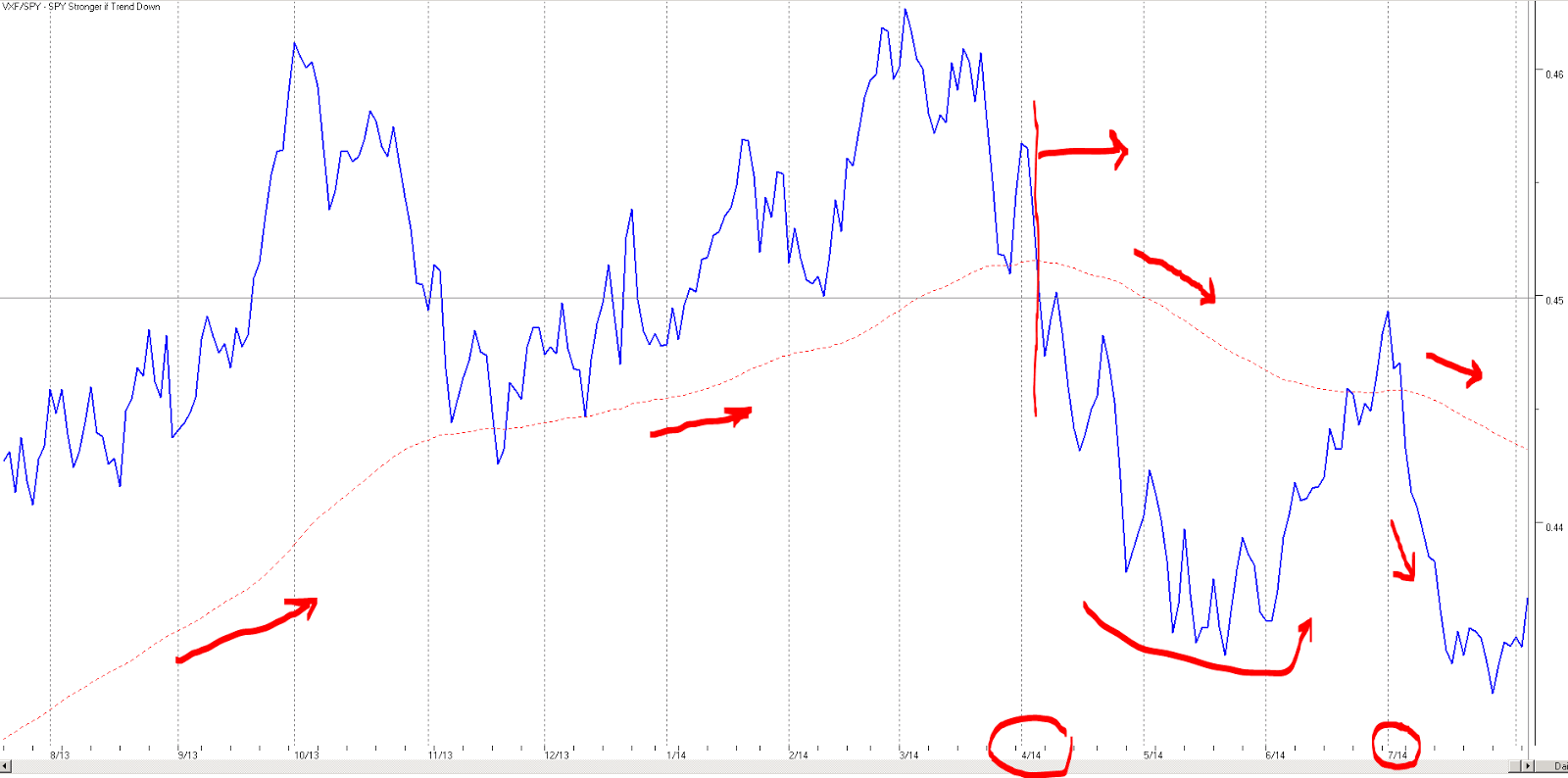
There is no doubt in my mind that we're seeing a transition to safety on a longer-term basis, and this means that we're entering a new phase of the market. This is best illustrated by a relationship that I follow which is the VXF ETF (which represents all the stocks in the market except those in the S&P500) and the SPY (which is the S&P 500 SPDR). Typically, the VXF is considered a "small cap" fund, where the SPY is considered large caps. Indeed, if you look at the individual holdings of each of these ETFs and sort by market cap you can see that the SPY dominates VXF in overall total market cap.
Here's the graph:
Right-click on the image to open in a new tab or window.
The first thing to realize is that up until around the middle of April, the longer-term trend line showed that VXF was outperforming the SPY. There were short-term violations of this concept, but the trend remained intact until mid April. As you can see in the graph above, the trend line has now taken on a downward slope, which means that the SPY is outperforming the VXF on a 65d time frame. There will be short-term violations of this statement too, but in general, money is moving to safety.
The implication for the TSP funds is that going forward we want more allocation to the C-Fund and away from the S-Fund, at least on a medium to long-term basis.
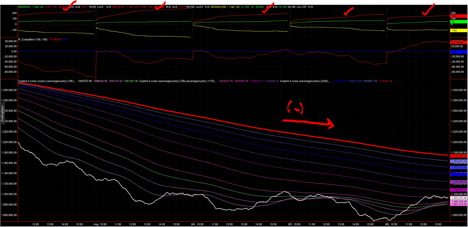
The next indicator that I use, which has not been in this territory for some time, is called a Cumulative Tick Ribbon. Essentially, this is a cumulative count of minute-by-minute transactions on the major exchanges, and it tallies whether all the stocks for a specific "tick" are increasing in price or decreasing in price. When you average these over multiple time frames you get an interesting view:
Right-click on the image to open in a new tab or window.
Ignore the top two panels and simply look at the bottom panel.
The white trace is the real-time, non-averaged value. The red trace is the longest time frame that I average, about 10 trading days. The negative slope of this line is troubling -- it simply tells me that on this time frame that we're down significantly. Further, since the slope is relatively constant for all the days shown, it tells you that we're not out of the woods yet.
Your eye may catch that the real-time, non-averaged value appears to have stabilized into a range. Yes, this is indeed what we are seeing, so perhaps we're at a bottom. We could also be at a pause with a potential to continue downward -- I simply do not know. Best to be prudent and protect gains.
The top panel in the figure above shows the number of NEW LOWS (red), NEW HIGHS (green), and difference between the two (yellow). This is over the past 52 weeks. The figure shows, without any ambiguity, that we are solidly hitting NEW LOWS on a day-over-day basis. Until that green line starts dominating the red line, I'll consider my time on the sidelines well spent.
~
At any rate, do what you will.
Remember, you are responsible for your decisions, and I am not. Please take ownership for your actions.
Regards,
pgd